2019 NE 24hr Challenge July 20th & 21st 2019, Team AltaOwnersForum.com is Official!


privateer703

AOF Addict
Likes
687
Location
Altoona, PA
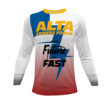
Here is an updated version with the AOF logo reversed and filled with a gradient. I also replaced the lightning bolt on the sleeve with the grey lines graphic Alta used on the stock EXR and MXR graphics. Comment if you like this better than the lightning bolt design. The AOF logo isn't the correct one, I could only apply the gradient to text in MSWord. I don't have any decent graphics software.

Alta_Jersey_Left_wGrey.PNG
 

OneLapper

"You don't *really* need the water pump...."
Forum's Sponsor
Likes
989
Location
Connecticut
Yes, better sleeve. Note quite sold on the rainbow color scheme of the letters though. Somehow it makes "owners" harder to read.

I don't know what the official Philip approved logo is, but "AltaOwnersForum.com" makes it easy to read and differentiate the three words when the first letter of each word is capitalized.
 

Philip

Administrator
Staff member
Likes
4,052
Location
Lake Havasu City, AZ
The AOF logo isn't the correct one, I could only apply the gradient to text in MSWord. I don't have any decent graphics software
The zip file that I posted yesterday has a font in it. You click on it in Windows and it will install a " Blackplotan" font into Windows and Word. This is the closest that I was able to find to the official Alta logo font.
 

Similar threads

Top Bottom